Polished Renovation Turns Two-Story Building in Sao Paulo into a Concept Store
12:40Any store that you look it makes an impression on you – sometimes in a positive manner and sometimes in the negative. Most importantly, a new tore needs to reflect the image of the brand it represents and showcases. It is all about finding that right balance between aesthetics and ergonomics even while ensuring there is proper visibility. The Loja Wentz Store designed by Felipe Hess Arquitetos has all that and a whole lot more with a polished white interior that perfectly showcases the best products of this concept store along with an ambiance that leaves you captivated.
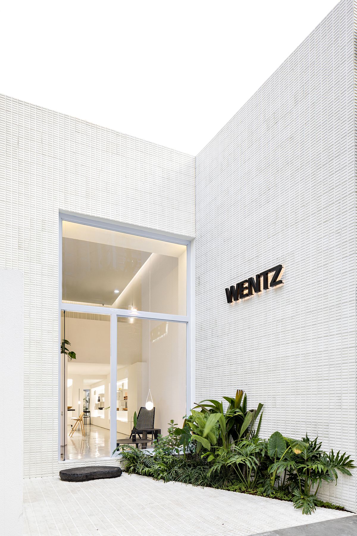
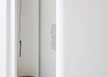
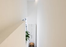
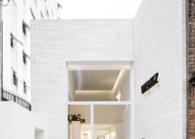
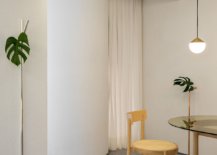
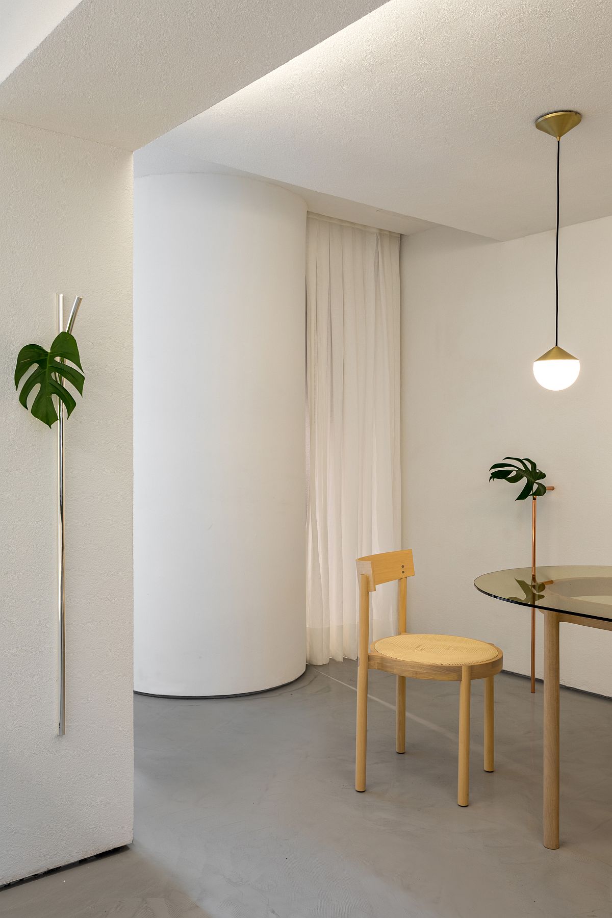
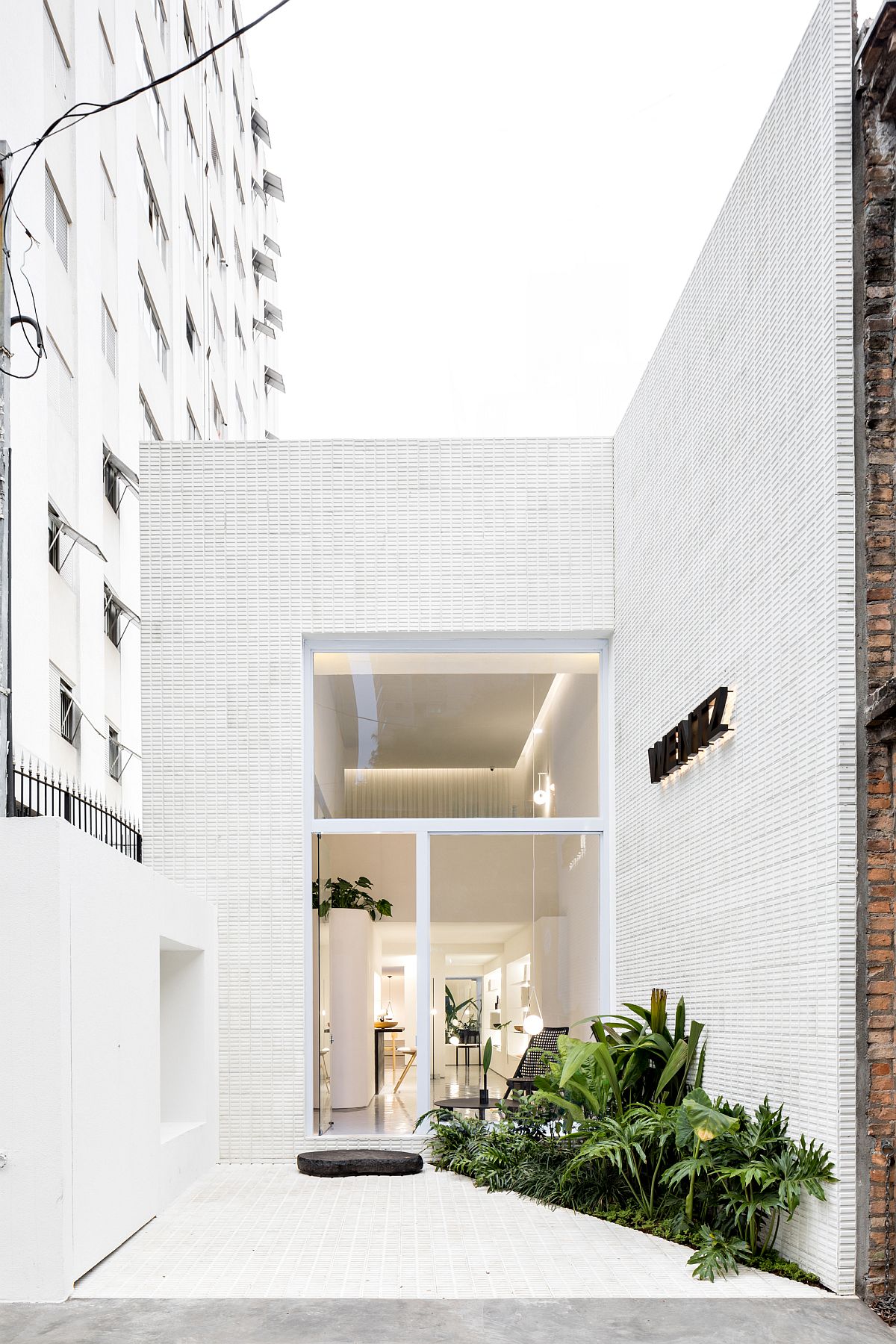
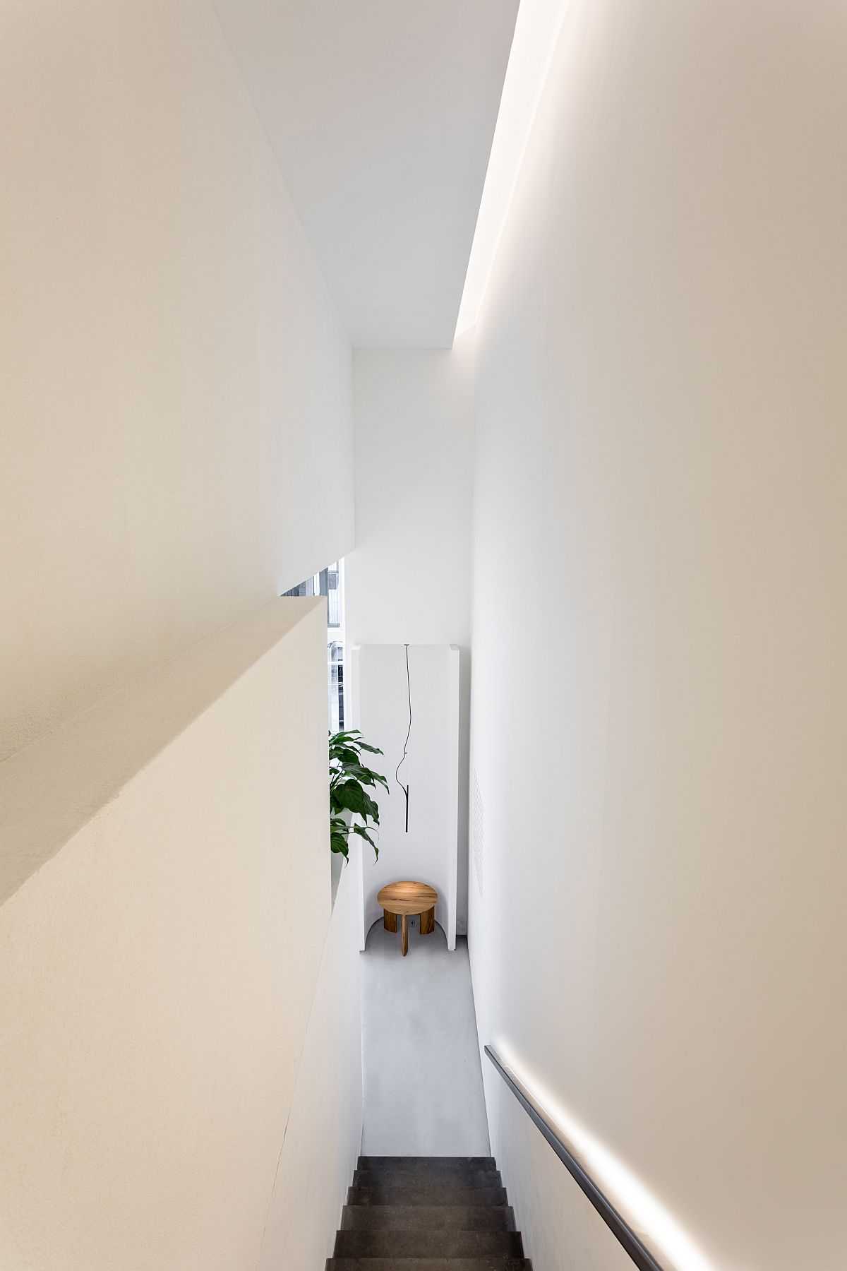
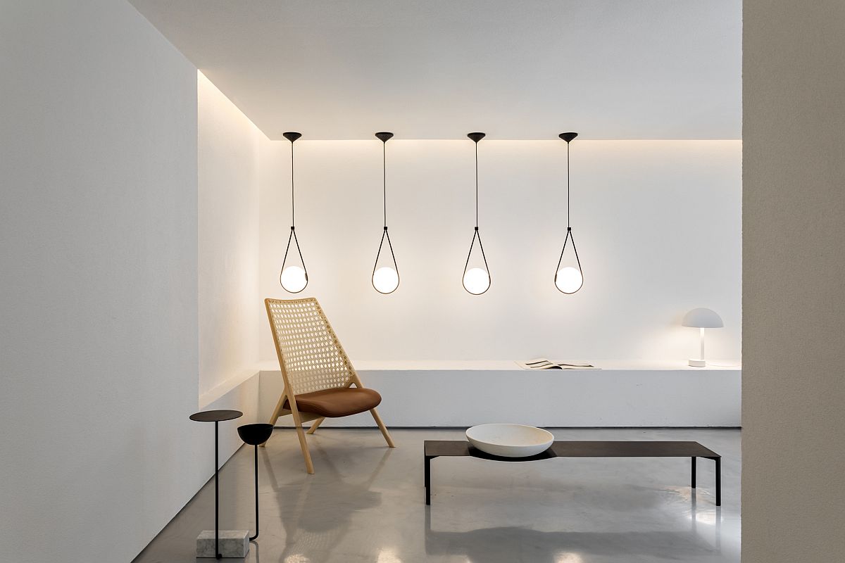
The new Sao Paulo concept store sits in a building that was once a two-story residential unit and the transformation is both practical and beautiful. An even layer of recessed lighting along with pendant lights welcomes you inside the store while and all-white, monochromatic backdrop ensures that every décor piece inside is perfectly highlighted. Each spaces feels special with a sleek staircase leading to the upper level and the mezzanine floor. A hint of greenery and gorgeous drapes complete this exclusive Brazilian outlet in an urbane neighborhood. [Photography: Fran Parente]
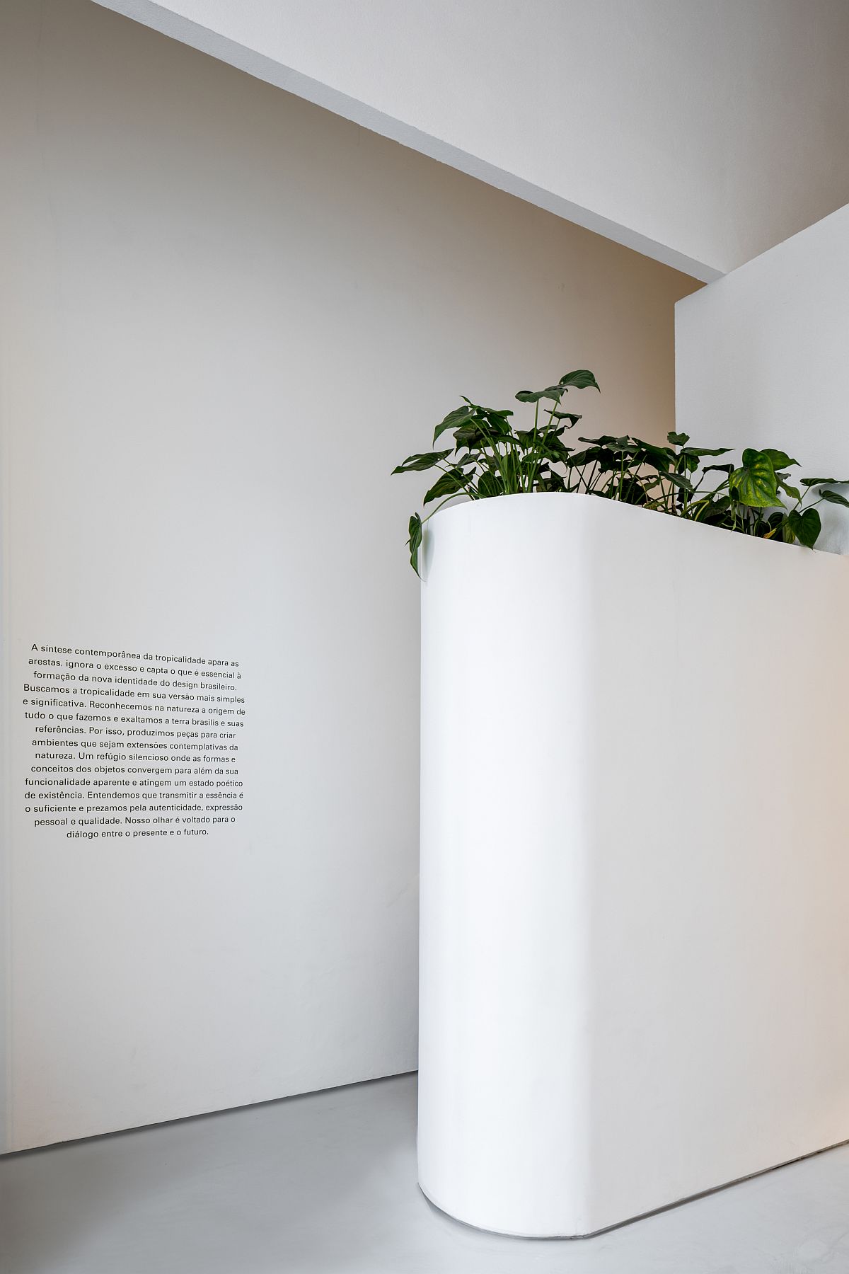
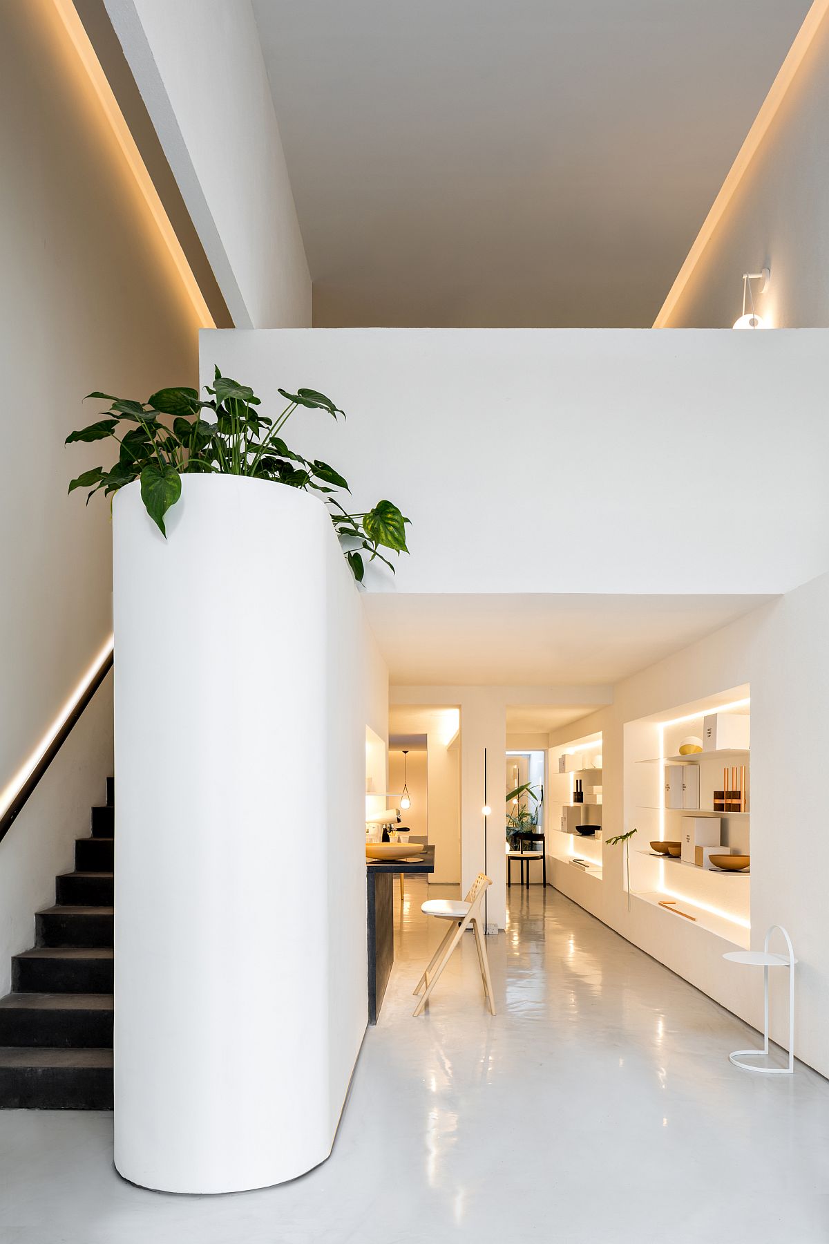
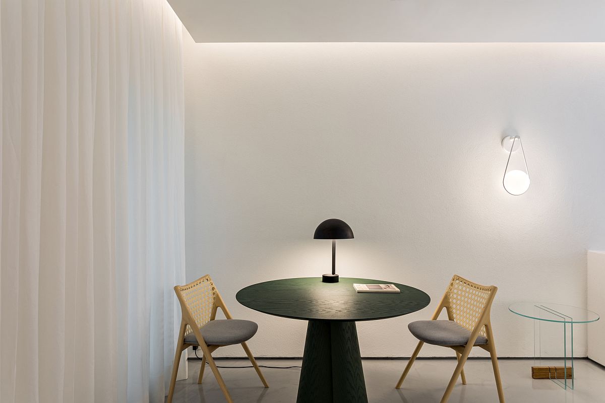
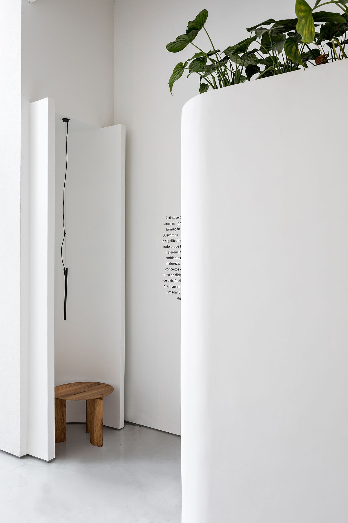
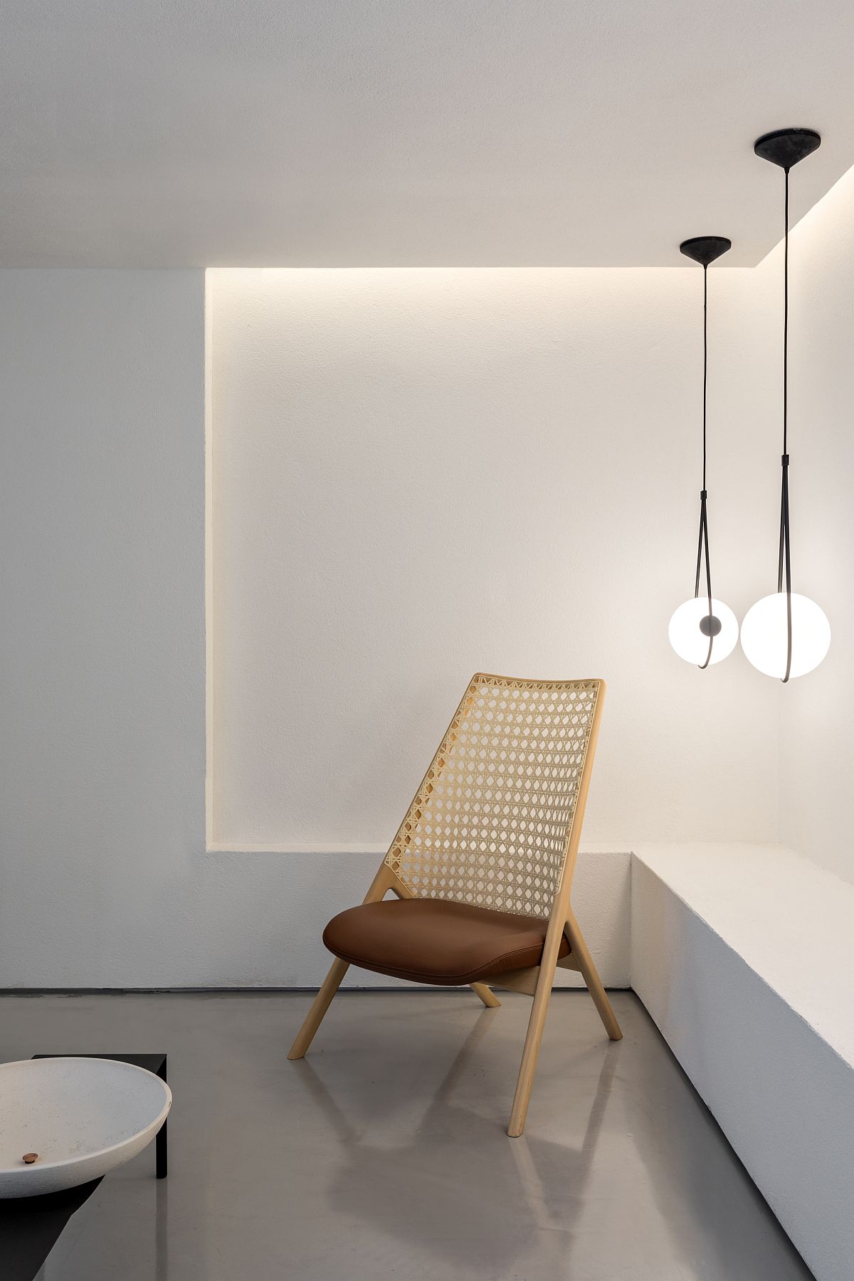
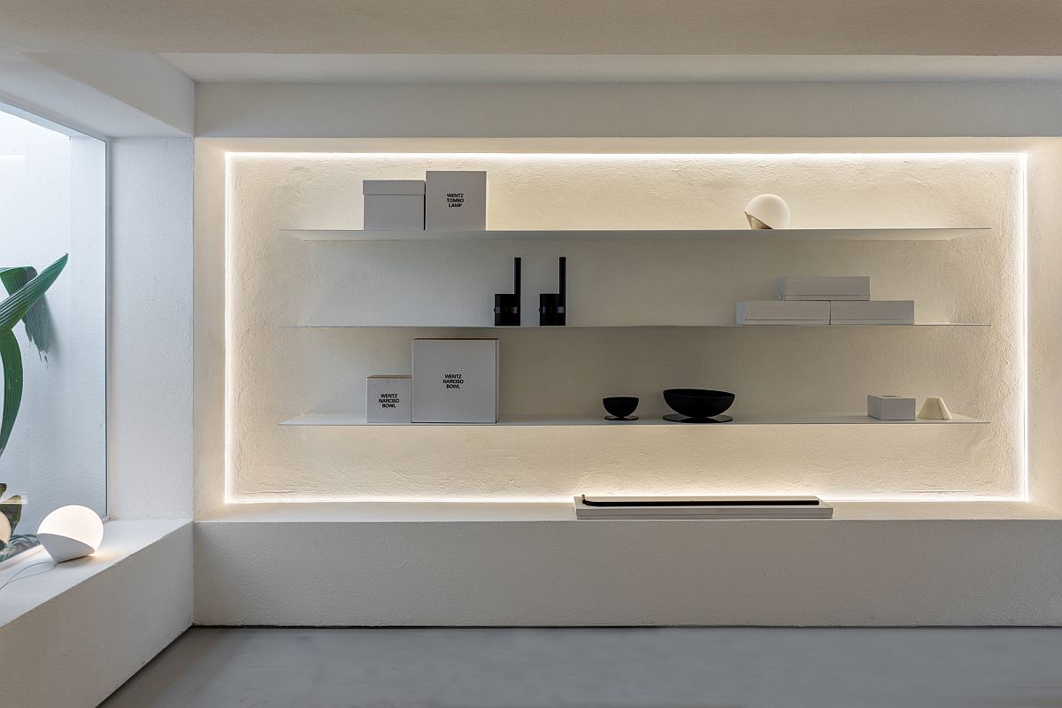
The store was built with the usage of few neutral coverings: hydraulic floor tiles at the facade, cement-based grouting for the floor, composition between textured and smooth walls to enhance volumetries. The lightning is diffuse, but also lights out the display spots in the store. The landscaping focuses on the essence that Wentz has: tropicality.
You're reading Polished Renovation Turns Two-Story Building in Sao Paulo into a Concept Store, originally posted on Decoist. If you enjoyed this post, be sure to follow Decoist on Twitter, Facebook and Pinterest.
Posted By : Sherry Nothingam
0 comments