Japanese Minimalism and Smart Functionality Shape Ultra-Tiny Coffee Shop
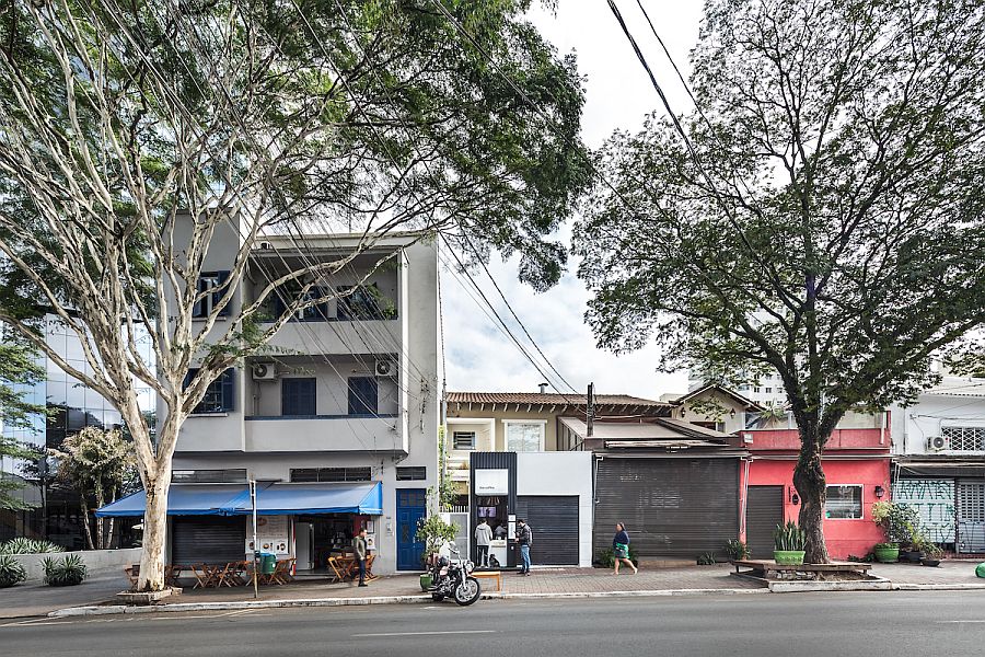
01:13The idea of minimalism is much more than make a style statement; it is an idea that also helps you save space and create more organized interiors. That is exactly the idea behind this cool gorgeous Pinheiros Coffee Shop designed by Studio Boscardin.Corsi Arquitetura in Brazil that embraces Japanese minimalism at its simple best. The coffee shop occupies just about 54 square meters of space and the front area along with the work space are much smaller than that. Just behind the coffee shop at the front is a warehouse that acts as a supporting unit to the commercial unit and both of the work in connection with one another.
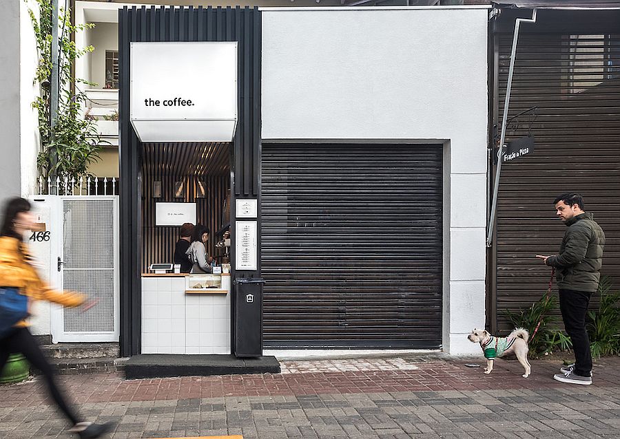




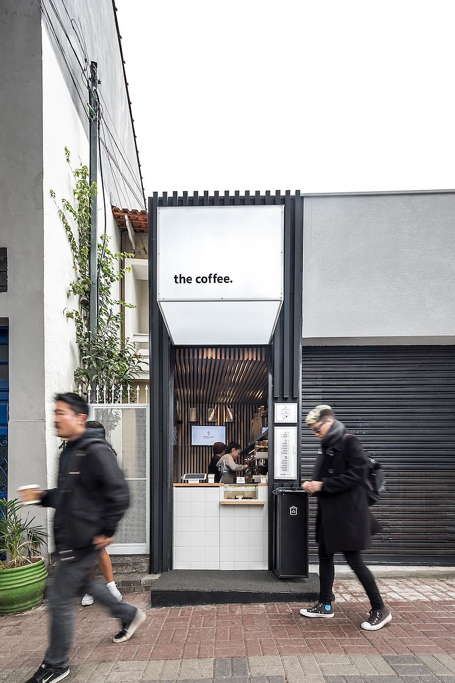
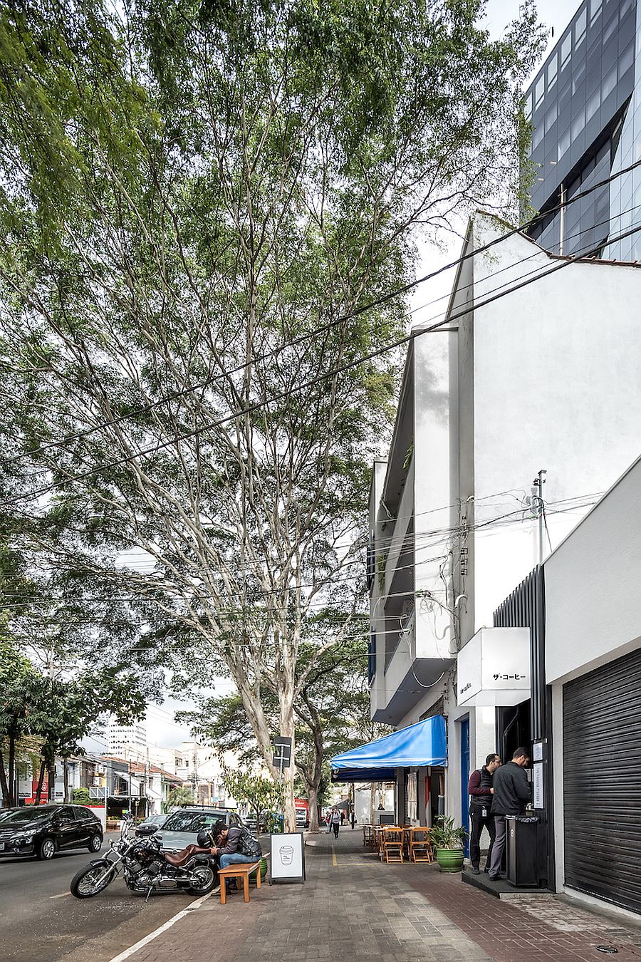
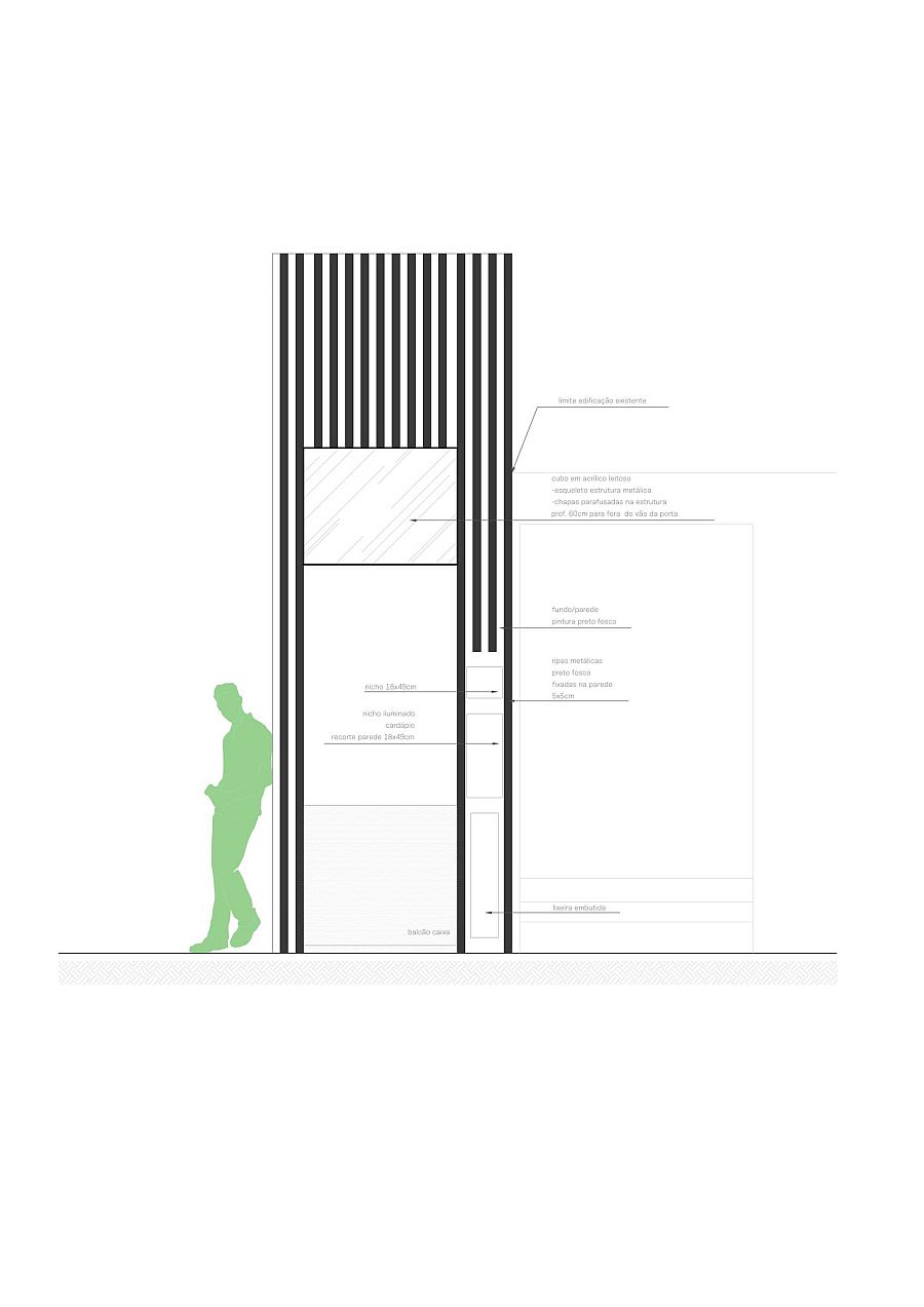
There is just enough space inside the coffee shop for a couple of people to work inside it and the rest of the wall space and vertical areas has been used to create smart shelves and storage units. Front of the office is clad in white with black metallic frame next to it allowing it to blend in with the street façade around the coffee shop. Easy on the eyes and unassuming, the coffee shop places emphasis on functionality with lighting adding another layer of brilliance to it.
RELATED: Beautiful Brick Walls: Warehouse Conversion in Fitzroy Conceals Twin Delights
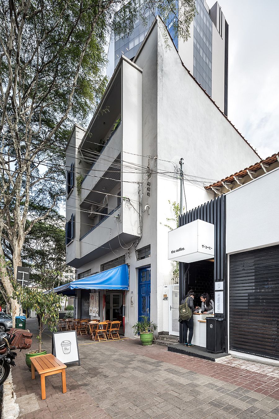

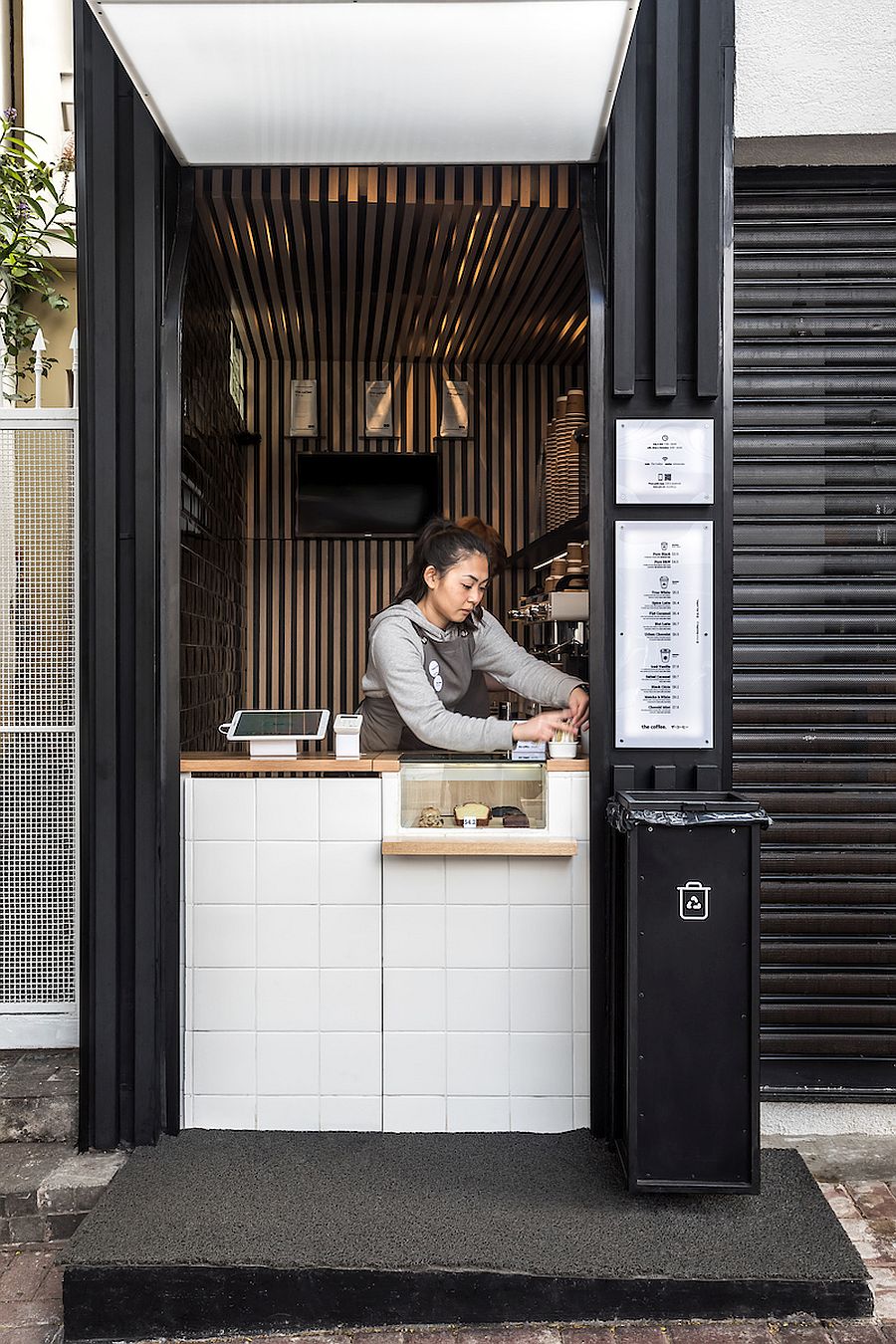
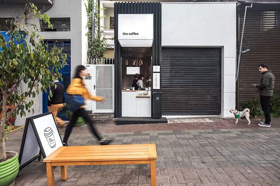
As a closed volume on the sides, the small internal area of 5.10m² was the big challenge, proposed with the functionality so that up to two baristas can work simultaneously, always sideways to the client. The connection between service and the 7.40 m² warehouse is ideal, with access through the back door, hidden in the slatted panel.
RELATED: Ultra-Tiny Manhattan Apartment with Wedge-Shaped, Space-Savvy Partition!
You're reading Japanese Minimalism and Smart Functionality Shape Ultra-Tiny Coffee Shop, originally posted on Decoist. If you enjoyed this post, be sure to follow Decoist on Twitter, Facebook and Pinterest.
Posted By : Sherry Nothingam
0 comments